
How leaders can make sense of the data
A simple strategy to gain information, knowledge, and wisdom.


Data is everywhere at work.
Your email, your instant messages, and in those seemingly endless spreadsheets.
You need to make sense of all the data, but you’re busy and don’t have time to become a data engineer.
But you also have a presentation to prepare for. So, you need a reliable way to develop knowledge and wisdom about the data.
Let me give you a framework that I learned about from DataCamp.
But first, common mistakes about data.
People are often short on time so they skip to analyzing the data in front of them.
However, this is like driving without a destination in mind.
Analyzing data is a part of the process, but it’s not the first thing you should do.
Instead you should start by:
Defining the question you want to answer
Understanding why the question is important
Collecting relevant data
Picking a tool to analyze the data (Use the one you’re most skilled at. Unless you have time to learn a new one)
Introducing the DIWK pyramid.
The pyramid is a model that will help you become an expert in the data, give an awesome presentation, and make the right decisions.
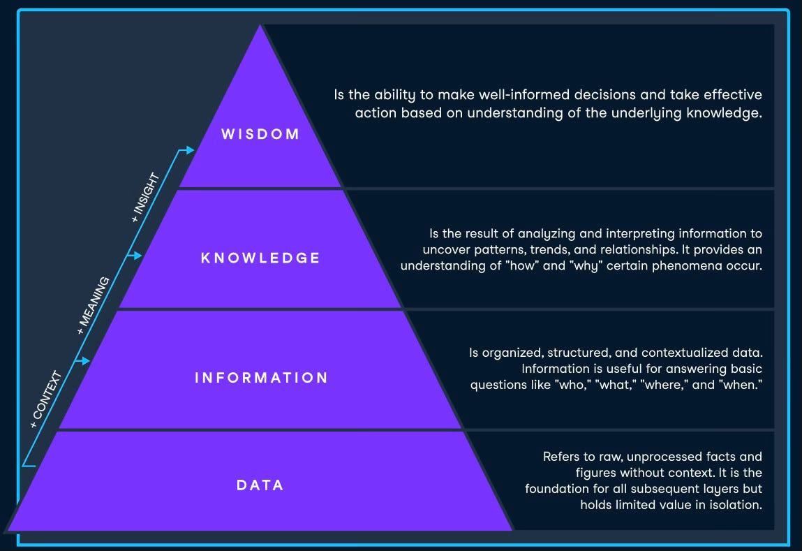
There are four components to the DIWK pyramid:
Data: The raw data collected from a source.
Information: Organized, structured, and contextualized data.
Knowledge: Information that’s been analyzed and interpreted.
Wisdom: Is using the knowledge gained to make decisions.
How to use it.
📊 Data
At this step, the data is in its raw form.
Let’s say you have to present on-call metrics. The raw data you might collect is number of events, time-to-resolution, and availability for the service.
But this data alone isn’t useful. To start making sense of this data you have to transform it into information.
📝 Information
You accomplish that by putting the data into context.
For instance: In March, the service was available for 99.9% of the time. There were 5 events, which accounted for 150 minutes of downtime. On average, it took 30 minutes to resolve the situation, but there was one outlier. On March 12th, one event took 120 minutes because of a critical system failure.
💡Knowledge
This is when you start analyzing why things happened.
You detect patterns, make generalizations or predictions.
In the on-call example, you will dig deeper to understand the timeline, summary, and lessons learned from the outlier on March 12th. This is often completed during a root cause analysis (aka postmortem).
🧠 Wisdom
Now it’s time to recommend next steps. You leverage the data, information, and knowledge gained to offer a course of action.
You might recommend making a change to the service, policy, or workflow to mitigate this issue from reoccurring.
Your goal is to share insights with your audience that they can’t get by simply reading the metrics on a dashboard.
Final words.
Analyzing data can be overwhelming.
There are thousands of courses that will teach you about SQL, Python, and Statistics. While these are valuable skills, you might not have time to become an expert in all of these. (After all, you have to present next week.)
But it is likely that you can put the data into excel, create a pivot table and use the DIKW pyramid to gain information, knowledge, and wisdom.
Then, when you’re ready, check out these 5 books for Data Engineering recommended by Mykola-Bohdan and sign-up for DataCamp’s Data Literacy course.
If you’re interested in reading more about leadership, I’d be happy to have you as a subscriber to the Becoming a Leader newsletter.